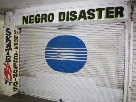
And this is also pretty unfortunate. But it happens to be in a very nice neighborhood.
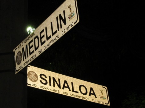
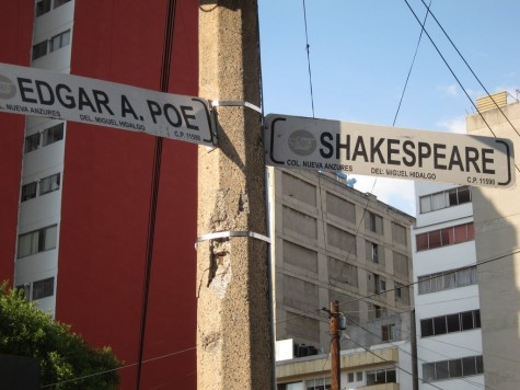
And there are other lovely combinations:
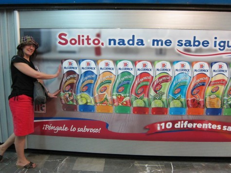
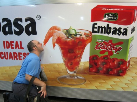
Excellent subway advertisements. Only because we were in Mexico City during Semana Santa, when crowds in the metro are at a minimum, could we take these photos without other people in them.
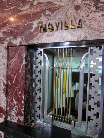
And then there’s this, much classier, in the Palacio de Bellas Artes. This font makes me want to buy tickets to anything.
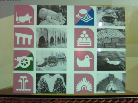
Finally, back to the metro. You may know that Mexico City’s metro is notable for the fact that each stop has a symbol as well as a name, to aid illiterate riders. We happened to walk past the public transport office (honest, just happened to!), where we saw these sign showing the inspiration for several of the metro-stop symbols.
Favorite: It’s a toss-up between the duck and the grasshopper, I think. What’s yours?
wow, great signage. alarming at times.
Grasshopper!
Now that I look closer, I appreciate the feather headdress a lot more… But the grasshopper is by far the cutest.